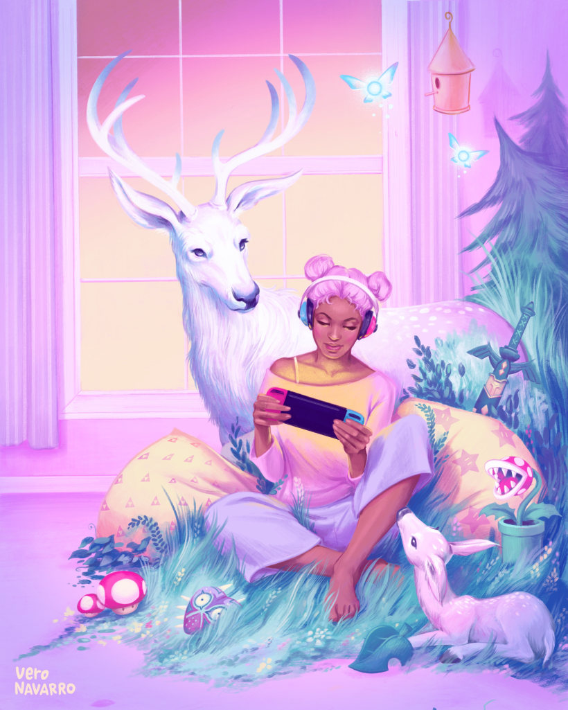
This course is both a 'learn to use' Procreate course and also a brief introduction to composition and colour theory concepts. Vero teaches these sections in a very quick and easy to understand way - they are even titled as a 'For Dummies' sections - which is perfect for me!
The artwork I created can be purchased on Redbubble
here.
 |
| Vero's final project on her Domestika course |
Vero herself is an incredibly talented and versatile artist - I love her work on Instagram (
@veronavarro.ig) which showcases her vivid imagination and technical agility. Her expert eye comes in useful when she gives feedback on the community forum. This is the one part of the Domestika platform I really enjoy - feedback directly from the artist! (Although not all artists give feedback, so it shouldn’t be an expectation).
 |
| Domestika screengrabs |
The Domestika videos tend to follow the same direction - the artist introduces each video with a verbal explanation, then proceeds to draw (sometimes in real time, sometimes speeded up). Usually the artist will narrate along the way. Some footage is from camera looking down at the artist, most footage are screen captures. Anything that requires references or additional information is placed below the Unit section under additional resources. Most of the artists on the Domestika roster do not speak English but so far the subtitles have been perfectly fine.
Vero's digital painting process was very insightful - she first creates a number of thumbnail sketches and plays around with the composition in each. At this early stage she already separates the main components into layers, to make it easy to move them around for each new composite. She then draws a fully cleaned up decent pencil sketch as her line art. Interestingly this is what she uses in her final project, which differs to some artists (including me) who then digitally ink over this pencil sketch with a brush or pen tool.
For my project, I chose to draw something to celebrate Chinese New Year (of the Ox). In old vintage 'nian hua' style of propaganda posters (
see this article) that celebrate New Year, there is always a happy well-fed child riding a koi carp or goldfish. The ideological message may not be subtle, but the artwork and graphic design was always incredibly well done.
 |
| Thumbnail sketches to experiment with composition |
She next makes a dozen or so thumbnail colour palettes and then uses one of them as a basis for the final artwork. During the painting process of the final project, she begins by painting in the background layers and moves layer by layer to the 'foreground'. This enables her to move objects around to improve the composition if needed.
 |
| Colour palette experiments over the thumbnails |
 |
| Cleaned up pencil sketch plus photo references |
I love her painting style but to be honest, it doesn't work for me. I struggle with colours so I prefer to use photo references and eye dropper tool to select colours from known objects, this feels safer to use compared to picking colours by eye. In fact Vero discusses this method as one of her colour-finding methods but she also uses the colour wheel in Procreate a lot to find opposing and neighbouring colours that work together. Whatever the painting style, Vero also emphasises sourcing a good selection of reference images first and demonstrates how to use them when preparing the final piece.
 |
| My Year of the Ox poster as my final project |
 |
| Close up detail - my daughter (who likes drawing anime) helped me with the eyes. |
 |
| I ended up painting this as I normally would, not following Vero's style, which she suggests is more than fine to do. |
Her finished artwork is definitely way more painterly than what I came up with. Vero emphasises in her videos and in her comments to 'just take from my course what you need and discard the rest'. I like how she encourages us to be free with how we interpret her lessons. For me personally, I just wanted to complete all the exercises from start to finish just to push myself a little bit. Hence why I also completed the final chapter on animation...
The animation chapter seems like a bonus add-on to the course. It feels like it was put in just because Procreate offers this as a function, but doesn't seem like something Vero herself uses much. I'm not hugely interested in animating my works but it was fun to try.
I do confess to skipping through the two videos about making ones own brushes. The process seemed fiddly and I didn't want to waste time when Procreate comes with brushes I already like. Speaking of Procreate, Vero actually begins the course with a run-through of the v5 updates, which adds a lot of new things that are different that Vero shows in the main videos.
 |
| Final project sketches, which I didn't use in the end. |
If I have one criticism of the course structure, it is that there seems to be an inconsistency from the beginner exercises to the final project. The first few exercises get us to draw some thumbnails and play around with both composition and colours. But the final project asks us to come up with something different and new. I don't mind this and in fact I did come up with a new set of ideas, but in the end, I reverted back to the original thumbnails. It maybe would have been more consistent to ask us to stick to the same project throughout. It's a minor quibble to be honest since any excuse to expand and develop my idea creation skills is a good one. And in actual fact, Vero's discussion on how to come up with cool new ideas is very good.
Overall a jam packed primer on illustration concepts and theory with interactive encouragement to work through your own project until completion. This is not a paint-by-numbers art tutorial, this is a course designed to allow artists (both newbies and more experienced) to grow and expand their own skills. Vero's passion for illustration and for sharing her experience with students is more than evident, she's easily the most interactive of all the teachers I've come across on Domestika so far.

.


No comments:
Post a Comment