Abraham Garcia’s distinctive retro style is what attracted me to this course. I’ve dabbled with vintage design elements in some of my work but in those cases I was just shifting around ready-made vectors and shapes. This time, I wanted to create my own original design from scratch so I was keen to see what tips I could pick up from this course on Domestika.
Be warned, this isn’t a course for complete beginners. From the get-go Abraham runs through his tools and techniques at rapid pace. It is assumed you already have at least basic Adobe Illustrator skills especially handling brushes and blending. you also probably need to have basic light and shade drawing skills. The whole style he teaches relies on your ability to apply repeating lines in order to give the illusion of light and shadow.
The Spanish to English subtitles are really poorly translated - it's like it was done on a very early prototype of Google translate. This is weird because Vero Navarro’s course translations were perfectly fine. But then Abraham’s course was made a few years ago so maybe it relies on a less sophisticated translation? Either way, it made it doubly hard for me to follow along. Plus he speaks very fast so the subtitles zip along speedily. I had to pause and rewind often.
But I’m glad I persisted because there are some very good tips being offered here. It's just a slog to get to.
The Course Assignment
Abraham's course asks us to design a whiskey label. It's a good platform to showcase the variety of vintage shading techniques that he teaches.
.
.
The image above is my final piece, but it took a lot of effort to get there. Here's the process:
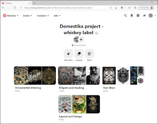
As with all good pro illustrators, Abraham showed how each project begins with the brainstorming of ideas which are sketched down as quick thumbnail drawings. This is followed by the collecting of images to create a mood board:
So far, so good. But before moving onto the project itself, it was time to practice those shading lines. Abraham asked us to use his methods to shade a sphere, pyramid and cube. I cannot tell you how frustrating these initial attempts were for me. I know how to use the blend tool and I know how to shade, but for some reason my brain found it hard to engage in this engraving style:
My efforts seemed shabby and I noticed already at this early stage that sometimes the lines would go out of synch if you erased them too much (prior to expanding). It's something you have to be aware of when shading this way.
Despite my hack handed early efforts, I moved on to my main project where I quickly got the hang of things...
Death Trooper
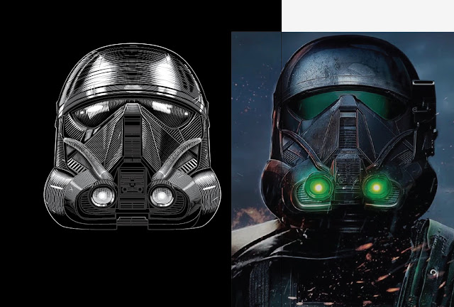
I decided to use Star Wars as my theme because I really like the Star Wars helmet art that artists such as Hydro74, TonyMidi and Charles AP create. Also because I love Rogue One film. My shading would be different to that taught by Abraham in that I would be using white vector lines on black, not black on white.
There's no dilly-dallying once on the main project, I got straight to work on the main visual element - the Death Trooper helmet. For reference I looked at a variety of photos and poses, this one where he is looking slightly up worked best for me:
Next stage was to work on the typographic elements. Handily I had bought a vintage fonts and flourishes vector bundle on Deal Jumbo many years ago but never really used them before. My whiskey label would be an ideal opportunity to apply them:
Whilst I did watch Abraham's videos, I didn't follow along precisely - for the most part I simply played around with the settings in Illustrator and referred back to vintage label designs for ideas. I did learn a handy way to create 3D drop shadows onto text (here).
With both text and main elements completed, I then moved to the layout design and decorative elements stage:
 |
| I mainly used linear lines to shade, with a little bit of cross hatching |
 |
| The little dents and scratches here are a nice custom brush tip from Abraham |
 |
| When shading, you apply white and back layers on top of each other to get the effect. |
 |
| Abraham also shows how to create custom brushes so you can make cool decorative borders. I used this to design a TIE Fighter plane border. |
 |
| The final part of the assignment is to apply ones design to a PSD mockup. |
Conclusion
This is a very technical course. It's ideal if you already are handy with Illustrator and want to expand your repertoire. I found it harder than other Domestika courses because the translations are poor and Abraham himself moves along at a rapid pace. I had to rewind each of his videos numerous times in order to understand what he was saying and doing. But the results are worth definitely worth persisting with.
I don't have plans to mimic his style of vintage engraved digital art, but I did pick up a lot of useful advice on how to achieve certain things in Adobe Illustrator that I will be using in future work.


No comments:
Post a Comment